Chocoladine is inspired by the fern leaves that curl and grow at the tips. In capital letters the shape will appear. This font is also in the retro category which is still popular today. Casual, warm, sweet that's about it. It is suitable for printing t-shirts, mugs, book covers, invitation, product branding, packaging, advertising, retro logos and many more. Thank you, I hope you enjoy it.
Monday, December 21, 2020
Download Now
Server 1Download Now
Server 2Download Now
Server 3
Introducing
Neuborn Font Family
Neuborn is a Sans Serif Font Family
(Light, Light Italic, Regular, Regular Italic, Regular Hollow, Regular Italic Hollow, Medium, Medium Italic, Medium Hollow, Medium Italic Hollow, Bold, Bold Italic, Bold Hollow, Bold Italic Hollow).
This Font Template contains Modern, Formal or Non Formal, Classy, Elegant, Strong, Readable, Stylish, Cool, Bold, Minimalist and easy to use.
FEATURES
- Uppercase and Lowercase letters
- Numbering and Punctuations
- Multilingual Support
- Works on PC or Mac
- Simple Installation
USE
Neuborn works great in any branding, name card, logos, apparel, produk pagaking, flyers, magazines, label, films, stationary, posters, etc. and any design project that requires a formal or informal touch.
Download Neuborn Fonts Family From HIRO.std |
English
HU Cookie is a cute handwritten typeface that can be used to express any lively or active moment.
The alphabets are not aligned or evenly written but are crooked like scribble, which gives you funny and informal vibe.
There are 2 weights of HU Cookie : light, semi bold
Greek
Το HU Cookie είναι μια χαριτωμένη χειρόγραφη γραμματοσειρά που μπορεί να χρησιμοποιηθεί για να εκφράσει οποιαδήποτε ζωντανή ή ενεργή στιγμή.
Τα αλφάβητα δεν είναι ευθυγραμμισμένα ή ομοιόμορφα γραμμένα, αλλά είναι στραμμένα σαν σκαρίφημα, κάτι που σας δίνει αστεία και ανεπίσημη ατμόσφαιρα.
Υπάρχουν 2 βάρη του HU Cookie: light, semi bold
Cyrillic
HU Cookie - это симпатичный рукописный шрифт, которым можно обозначить любой живой или активный момент.
Алфавиты не выровнены и написаны неравномерно, они изогнуты, как каракули, что создает забавную и неформальную атмосферу.
HU Cookie имеет 2 толщины: light, semi bold
Download Now
Server 1Download Now
Server 2Download Now
Server 3
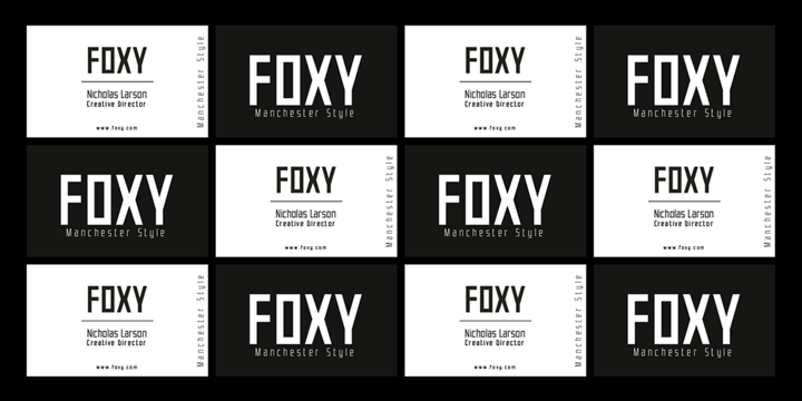
Chamelton is a massive layered font family that gives a wide range of creative choices for design creation using combinations of layers, colors, and weights. The collection includes 109 Sans Serif all-caps fonts, three weights monoline script, plus 198 extras for even more creative support.
The base of Chamelton is a classic Sans Serif shape intentionally designed without strong stylistic accents to leave the styling space for layer combinations and also better complementing with other fonts outside the family. It can be used as a complete design tool or as a partial element to complement your work.
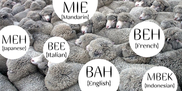
Primarily Chamelton is designed for any type of text that needs to stand out and catch the eye. Identity, labels, packaging, price tags, signboards, posters and magazines, headlines, websites, apps or video footage - you name it!
Combination layers inside the subfamily and between can give tons of options. Some styles can be used only as part of a layer set, but a lot of them can be used as stand-alone fonts. Keep in mind that the layers match only within their weights.
A Chamelton font family is offering You:
- Chamelton 10 Display - 7 weights: Thin, ExtraLight, UltraLight, Light, Regular, SemiBold, Bold, Black.
- Chamelton 20 Outline - 3 weights: SemiBold, Bold, Black. 2 layers for each weight.
- Chamelton 21 Inline - 3 weights: SemiBold, Bold, Black. 3 layers for each weight.
- Chamelton 22 Dots - 3 weights: SemiBold, Bold, Black. 2 layers for each weight.
- Chamelton 23 Lines - 3 weights: SemiBold, Bold, Black. 2 layers for each weight.
- Chamelton 24 Emboss - 3 weights: SemiBold, Bold, Black. 3 layers for each weight.
- Chamelton 25 Gradient - 3 weights: SemiBold, Bold, Black.
- Chamelton 30 3D - 3 weights: SemiBold, Bold, Black. 4 layers for each weight.
- Chamelton 31 Extrude - 3 weights: SemiBold, Bold, Black. 4 layers for each weight.
- Chamelton 32 Divided Extrude - 3 weights: SemiBold, Bold, Black. 4 layers for each weight.
- Chamelton 33 Flat Shadow - 3 weights: SemiBold, Bold, Black. 2 layers for each weight.
- Chamelton 34 Drop Shadow - 3 weights: SemiBold, Bold, Black. 4 layers for each weight.
- Chamelton 35 Gap - 7 weights: Thin, ExtraLight, UltraLight, Light, Regular, SemiBold, Bold, Black
- Chamelton 36 Script - 3 weights: Regular, Bold, Black.
- Chamelton 40 Extras - 198 graphic elements: Logos, Banners, Arrows, Stripes, Flags, and
Labels.
It is very easy to create a layered multi-colored font - just layer them over the top of one another and give them a different color. Chamelton works great in any graphics software that allows you to use layers. For Adobe Photoshop, Adobe Illustrator, Adobe InDesign, Adobe XD, Sketch, and Figma included guides with the best practice of use. Check the Specimen PDF for more information.
Download Chamelton Fonts Family From Alex Khoroshok |
Sunday, December 20, 2020
Hendbras is handcrafted font duo created with a brush and ink, bold and irregular baseline. Contains a complete set of lowercase, uppercase, alternates, ligatures, punctuation, numbers, and multilingual support. This font ideal for use in watercolor design or lettering style bold hand, such as posters, wedding elements, t-shirt, apparel, cover books, business cards, greeting cards, branding, merchandise, invitations and handmade quotes and more.
Viable Logic font, has a neat and clean character
new face sans serif fonts, in response to the need for innovative and new designs, for that this sans serif font family has different characters namely bold, thin and regular.
This font is simple yet neat and elegant, the design of this typeface gives it a clean, modern look and a unique style to help give it a captivating look when you use it.
This font is perfect for strong text with displays for a wide variety of branding, advertising, posters, banners, packaging, news headlines, magazines, websites, logo design, and more.
Download Now
Server 1Download Now
Server 2Download Now
Server 3
The Typorium presents a new optimized and enriched version of ITC Ellipse which first appeared in 1996 in the International Typeface Corporation typeface library. ITC Ellipse Neo design has been lightly modified. Three weights have been added (light, Medium, Extra Bold, including Italics) to the original Regular and Bold styles.
ITC Ellipse Neo is both modern and classic. Modern in the unusual shape based on the geometric ellipse form. And classic in the structure of some letters like the lower cases c, e, g, o, s. These letters alone could come from a traditional typeface, but they fit perfectly with the atypical rest of the alphabet giving it a present-day and traditional mix. Furthermore, the ellipse shape fits naturally in the italic styles, giving the font an organic and fluid feeling.
ITC Ellipse Neo offers OpenType features such as alternate characters for upper and lower case, and an extended accented character set to support many languages. Five weights have been created for each style to offer a wide range of graphic possibilities in a tidy digital footprint.
Designer: Jean-Renaud Cuaz
Publisher: Typorium
MyFonts debut: December 15, 2020
Le Typorium présente une nouvelle version optimisée et enrichie d'ITC Ellipse qui est apparue pour la première fois en 1996 dans la bibliothèque de caractères de l'International Typeface Corporation. Le design de ITC Ellipse Neo a été légèrement modifié. Trois graisses ont été ajoutées (léger, moyen, extra gras, y compris les italiques) aux styles originaux Regular et Bold.
ITC Ellipse Neo est à la fois moderne et classique. Moderne dans le dessin inhabituel basé sur la forme géométrique de l’ellipse. Et classique dans la structure de certaines lettres comme les minuscules c, e, g, o, s. Ces lettres pourraient provenir d'une police de caractères traditionnelle, mais elles s'intègrent parfaitement avec le reste de l'alphabet plus insolite en lui donnant un mélange de modernité et de tradition. De plus, la forme de l'ellipse s'intègre naturellement dans les styles italiques, donnant à la police une sensation organique et fluide.
ITC Ellipse Neo offre des fonctionnalités OpenType telles que des caractères alternatifs pour les capitales et les bas de casse, et un jeu de caractères accentués étendu pour prendre en charge de nombreuses langues. Cinq graisses ont été créés pour chaque style afin d'offrir un large éventail de possibilités graphiques pour une empreinte numérique rigoureuse.
Download ITC Ellipse Neo Fonts Family From Typorium |
Search This Blog
Blog Archive
- July 2022 (4)
- April 2021 (73)
- March 2021 (140)
- February 2021 (125)
- January 2021 (130)
- December 2020 (134)
- November 2020 (128)
- October 2020 (124)
- September 2020 (72)
- August 2020 (93)
- July 2020 (88)
- June 2020 (78)
- May 2020 (62)
- April 2020 (18)
- March 2020 (61)